Crashsignal.ai: backtest results (1996-2025)
Why macro signals identify systemic risk patterns better than headlines
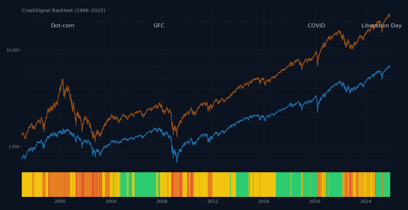
CrashSignal combines credit spreads, volatility, yield curve dynamics and liquidity indicators (VIX, yield curve, credit spreads, M2 money supply, term premium, Buffett ratio) into a structured composite risk signal.
When three or more indicators turn red, market risk conditions have historically shifted into a higher-stress regime.
This 30-year backtest shows how the signal performed against S&P 500 and Nasdaq Composite during growth periods, regime shifts, and all major crashes and how investors can use this to make educated investment decisions.
Signal performance over the last 29 years
Performance vs the S&P500
| Signal | Avg Level | Avg Drawdown | 1M Fwd | 3M Fwd | 1Y Fwd | Days | % Period |
|---|---|---|---|---|---|---|---|
| 0 | 2,802 | -5.6% | +0.6% | +1.8% | +6.2% | 2,355 | 32% |
| 1 | 1,892 | -10.6% | +0.8% | +2.1% | +9.9% | 2,869 | 39% |
| 2 | 1,706 | -19.8% | +0.8% | +2.8% | +9.4% | 1,693 | 23% |
| 3 | 1,679 | -29.5% | +1.0% | +2.6% | +10.2% | 358 | 5% |
Performance vs the Nasdaq
| Signal | Avg Level | Avg Drawdown | 1M Fwd | 3M Fwd | 1Y Fwd | Days | % Period |
|---|---|---|---|---|---|---|---|
| 0 | 7,840 | -20.0% | +0.8% | +2.3% | +9.3% | 2,355 | 32% |
| 1 | 4,655 | -28.3% | +0.9% | +2.6% | +13.9% | 2,869 | 39% |
| 2 | 4,240 | -37.4% | +1.4% | +5.0% | +15.3% | 1,693 | 23% |
| 3 | 4,031 | -54.4% | +2.2% | +5.8% | +20.7% | 358 | 5% |
Key findings
The signal works: risk amplifies, but so does reward.
- Calm Markets (0-1 Red): This is the "growth zone" (71% of the time). Drawdowns are shallow (-5% to -10%), making it safe to compound returns.
- High Risk (2-3 Red): This is the "danger zone" (only 5% of the time). Drawdowns triple (-30% S&P, -54% Nasdaq), signaling meaningful stress.
- The Opportunity: While risk spikes at Signal 3, forward 1-year returns are actually highest here (+10.2% S&P, +20.7% Nasdaq)—confirming that reacting to extreme fear (buying or re-risking when the signal eventually clears) pays off.
Note: Drawdown definition: Average drawdown represents the average peak-to-signal decline already experienced when the signal level was observed. It is descriptive, not predictive.
How the signal behaved during major crashes
Dot-Com Crash
Mar 2000 – Oct 2002Global Financial Crisis
Oct 2007 – Mar 2009COVID Crash
Feb 2020 – Mar 2020Liberation Day Crash
Apr 2, 2025 – Apr 10, 2025Key findings
Macro deterioration vs. external shocks: the signal adapts.
- Dot-Com & GFC (Macro Deterioration): These were structural crashes driven by overvaluation and credit stress. The signal averaged High Risk (2.0) and Medium Risk (1.4) for months, giving investors ample time to defend capital before the deepest lows.
- COVID (External Shock): A fast, unforeseen pandemic. The signal reacted instantly to the volatility spike (VIX), flashing Fast Risk (1.5) to warn that the sell-off had momentum, not just noise.
- Liberation Day (Policy Shock): A sudden tariff announcement. The signal identified a "Flash" risk regime but crucially calmed quickly (by Apr 30), correctly signaling that this was a temporary policy shock, not a lasting bear market.
Three ways investors can use the signal
1) Stay invested during growth (0–1 red)
2) React fast when real risk appears (regime shift to 2+ red)
3) Make better decisions after crashes (shock vs prolonged bear)
Key findings
A tool, not a crystal ball: investors can use probability to their advantage.
- Stay Invested (0-1 Red): This is the baseline. With 72% of days in this regime and positive forward returns, the data supports staying fully invested to capture long-term compounding.
- React to Shifts (2+ Red): This is the"check engine" light. When the signal jumps to 2+ (85 times in 29 years), risk of a deeper drawdown spikes. It’s the time to review leverage, tighten stops, or hedge—not necessarily to sell everything, but to stop driving blind.
- Post-Crash Re-Entry: The signal helps distinguish a "falling knife" from a "floor." In prolonged bears (like GFC), the signal stays elevated (2+ red) for months. In sharp shocks (like COVID/Liberation Day), it calms down quickly. Waiting for the signal to drop back to ≤1 helps confirm the worst is over.
Data & methodology
📊 Data Sources
- ▪ S&P 500 & Nasdaq: Daily closing prices (Yahoo Finance API).
- ▪ Macro Indicators: Federal Reserve Economic Data (FRED).
- ▪ Period: Jan 1, 1996 – Nov 28, 2025 (29 years).
⚙️ Signal Logic
- ▪ No Repainting: Signals are calculated using only data available on that trading day.
- ▪ Fixed Thresholds: Rules for "red" signals are constant across the entire backtest period.
- ▪ Daily Resolution: Signal updates every trading day at market close.
Disclaimer
Past performance doesn't guarantee future results. Educational analysis only.